(01) Beauty / 2026

Whitening Strips

A Meta creative system for PAP whitening strips, built around the everyday frustrations and confidence moments that drive people to whiten their smile.

(02) The designs

Each design carries the same research thesis with a different angle on it. This is what the a/b tests looked like.

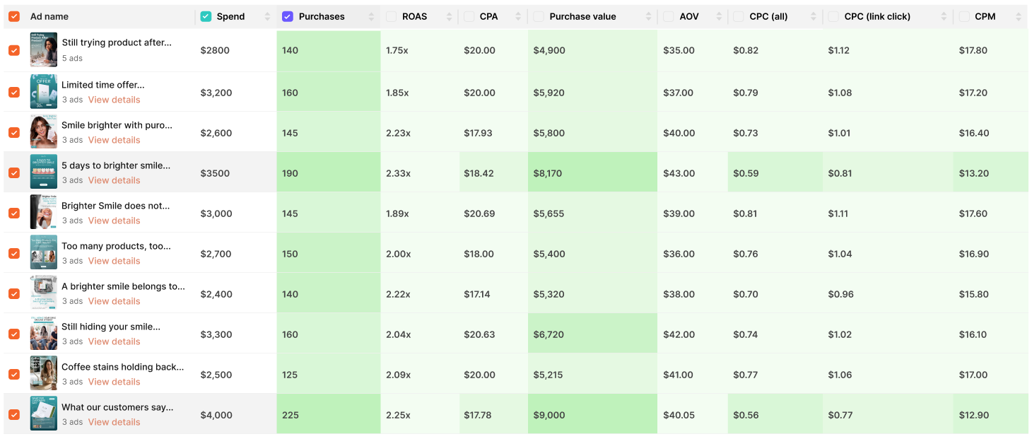
30-Day Account Summary

Whitening Strips - 30-day account summary
$30,000
Total Spend
1,580
Total Purchases
$62,100
Total Purchase Value
2.07x
Overall ROAS
$39.30
Average AOV

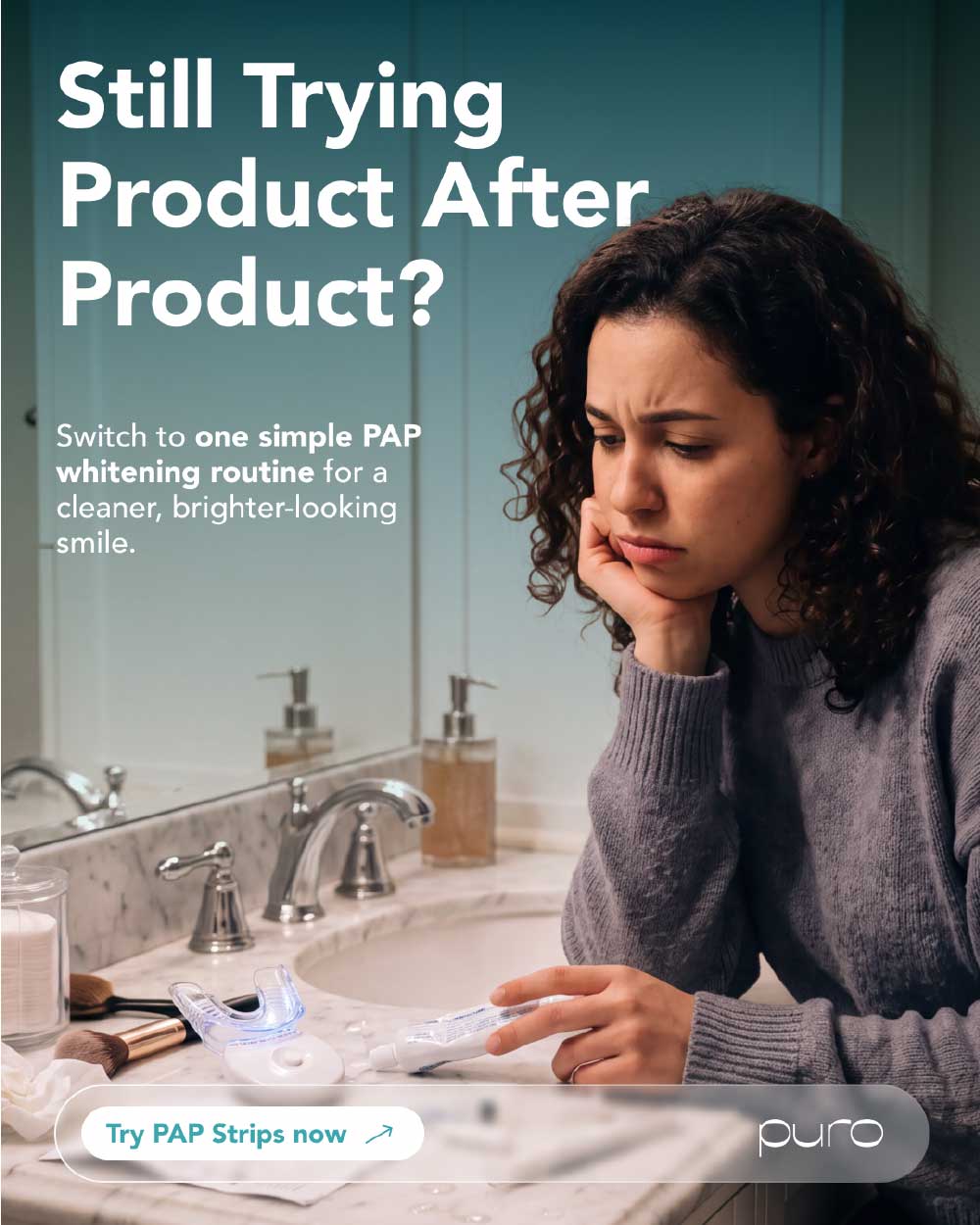
Design 01

Whitening Strips - design 1

Angle of Communication

Stop Trying Product After Product. A problem-aware angle that positions PAP whitening strips as a simple alternative for people frustrated with complicated or ineffective whitening routines.

Desire / Avatar

Avatar: Men and women who want a whiter, cleaner-looking smile and have already tried different teeth-whitening products. They value simplicity, convenience, and an easy routine they can stick to.
Core Desire: Get a brighter-looking smile without constantly buying and trying different whitening products.

Description

The ad opens with the relatable question, “Still trying product after product?” immediately highlighting the frustration of searching for an effective whitening solution. It then introduces the idea of switching to “one simple PAP whitening routine for a cleaner smile,” positioning the whitening strips as an uncomplicated solution. The design ends with a direct “Try PAP Strips Now” CTA, giving the audience a clear next step.

Why this works

  • Opens with a highly relatable pain point for people who have tried multiple whitening products.
  • Creates a clear contrast between product-hopping and a simple routine.
  • PAP strips become the solution to the frustration, rather than just another whitening product.
  • Focuses on the desired outcome of a cleaner-looking, whiter smile.
  • The simple message is easy to understand quickly, making it suitable for Meta's fast-scrolling environment.
  • The CTA directly connects the problem to the next action: “Try PAP Strips Now.”

Design 02

Whitening Strips - design 2

Angle of Communication

Limited-Time Offer / Value-Driven Whitening. A promotional angle that uses a strong discount and product-focused visual to encourage shoppers who are already interested in teeth whitening to take action now.

Desire / Avatar

Avatar: Men and women looking for a convenient way to achieve a whiter, cleaner-looking smile, especially price-conscious shoppers who are more likely to purchase when there is a compelling limited-time offer.
Core Desire: Get their desired whitening strips at a better price while taking the next step toward a brighter-looking smile.

Description

The ad puts the “Limited Offer – Save Up to 30% Off” message front and center to immediately communicate the promotion. A hero image of the Puro whitening strips makes the product the visual focus, while “Shop Now” provides a clear and direct path to purchase. The clean product-led composition keeps the message simple and makes the offer and product instantly understandable.

Why this works

  • “Save Up to 30% Off” creates immediate value and grabs attention.
  • The limited-offer framing introduces urgency and encourages faster decision-making.
  • The hero product image makes it immediately clear what is being offered.
  • A simple offer → product → CTA structure works well for conversion-focused Meta creatives.
  • Targets shoppers who already have some purchase intent and need an extra incentive to act now.
  • Keeps the creative product-focused and easy to process while scrolling.

Design 03

Whitening Strips - design 3

Angle of Communication

Effortless Whitening Routine / Lifestyle Transformation. The creative positions Puro whitening strips as an easy part of a daily routine, combining a clear time commitment with a visually aspirational smile-focused lifestyle.

Desire / Avatar

Avatar: Women and men who want a brighter, more confident-looking smile without adding a complicated step to their routine. Particularly appealing to beauty-conscious consumers who care about their appearance and want a convenient at-home whitening solution.
Core Desire: Achieve a brighter-looking smile through a simple 30-minute daily routine that fits comfortably into everyday life.

Description

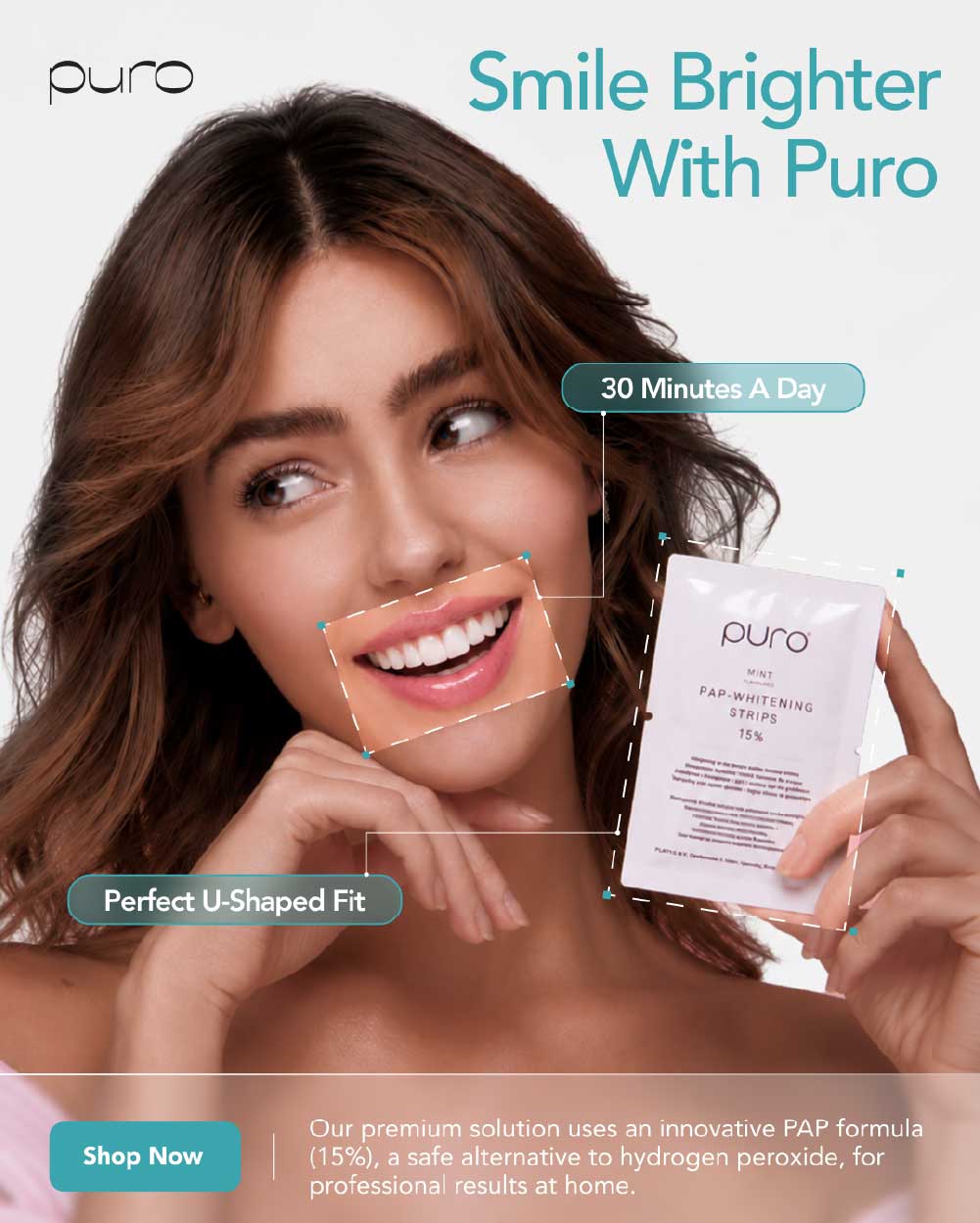
The ad uses a beautiful, smile-focused lifestyle image of a woman applying Puro whitening strips, immediately connecting the product with personal beauty and confidence. The headline “Smile Brighter with Puro” communicates the desired outcome, while “30 Minutes a Day” makes the routine feel simple and manageable. The perfect U-shaped fit highlights the product design and comfortable application, while the “Shop Now” CTA drives the viewer toward purchase.

Why this works

  • Leads with the desired outcome, a brighter smile rather than a technical product feature.
  • “30 Minutes a Day” makes the whitening routine feel simple and achievable.
  • The U-shaped fit provides a concrete product benefit that differentiates the strips.
  • The close-up focus on the woman's smile creates an immediate beauty and lifestyle connection.
  • The aspirational visual helps viewers picture themselves using the product and achieving the desired result.
  • Combines emotional appeal (confidence/beauty) with functional benefits (time + fit).
  • The direct “Shop Now” CTA gives interested shoppers a clear next step.

Design 04

Whitening Strips - design 4

Angle of Communication

Clear Timeline / Visible Transformation. The creative focuses on a simple, defined 5-day whitening routine and visually communicates the journey from a duller-looking smile to a brighter-looking one.

Desire / Avatar

Avatar: Men and women who want to improve the appearance of their smile and prefer a clear, structured whitening routine with an easy-to-understand timeframe rather than an open-ended process.
Core Desire: See a brighter-looking smile in just 5 days through a simple 30-45 minute daily routine.

Description

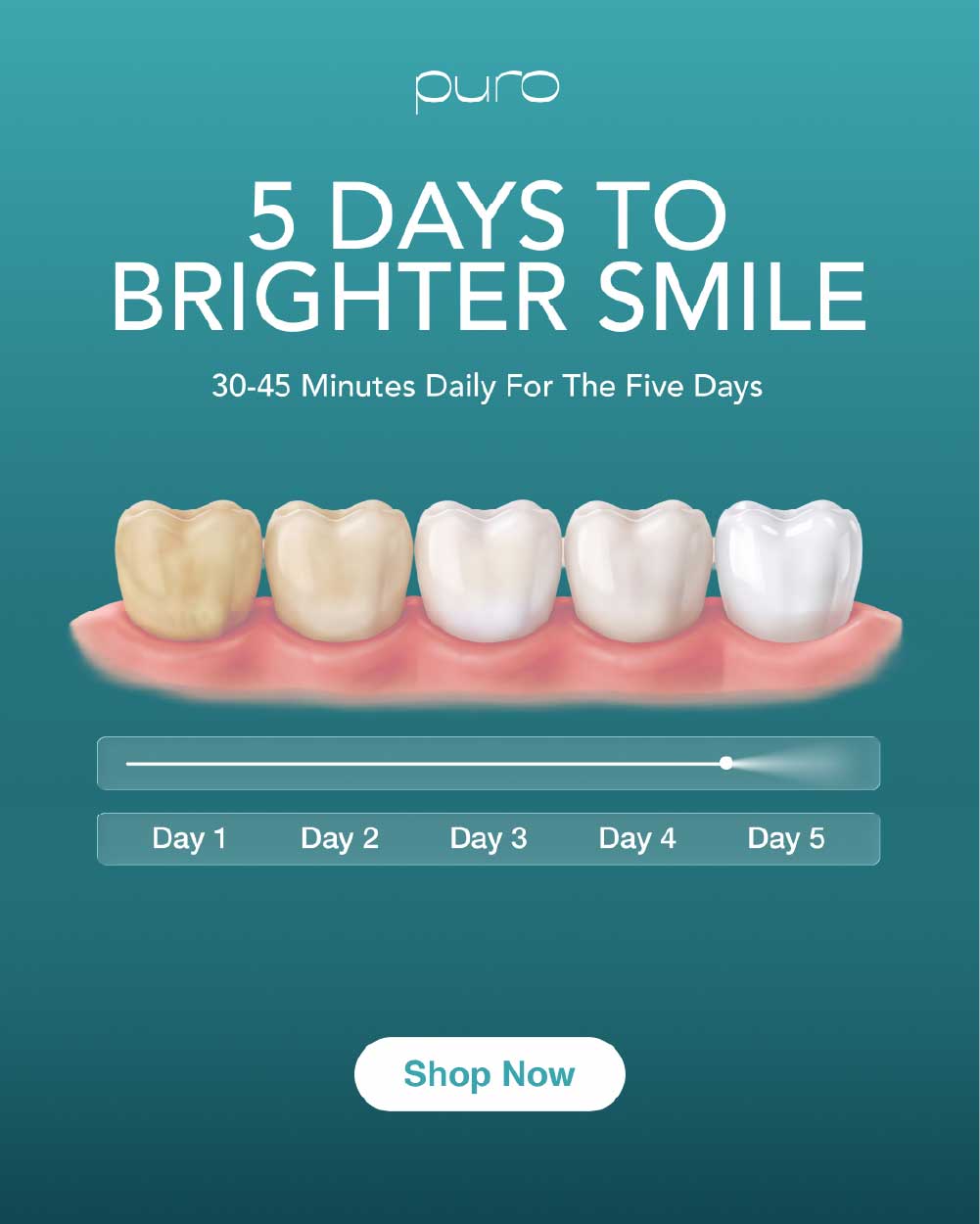
The ad opens with the bold message “5 Days to a Brighter Smile,” immediately communicating a clear timeframe. A visual journey shows the progression from yellow-looking teeth to a brighter-looking smile, making the transformation easy to understand at a glance. Supporting copy explains the routine: “30-45 Minutes Daily • 5 Days.” The creative finishes with a direct “Shop Now” CTA.

Why this works

  • A specific 5-day timeframe makes the whitening routine feel simple and achievable.
  • The before-to-after visual journey communicates the intended outcome instantly.
  • “30-45 Minutes Daily” sets clear expectations around the routine.
  • The transformation visual creates a strong visual hook for Meta's fast-scrolling environment.
  • Combines a desired outcome + clear process + timeframe, reducing uncertainty.
  • The “Shop Now” CTA captures shoppers who are ready to start their whitening journey.

Design 05

Whitening Strips - design 5

Angle of Communication

Emotional Pain Point → Confidence Restoration. The creative taps into the insecurity of hiding your smile around others and positions daily whitening as an effortless way to feel more confident showing it.

Desire / Avatar

Avatar: Men and women who feel self-conscious about the appearance of their teeth, particularly in social situations, photos, and gatherings with friends, and want to feel more comfortable smiling openly.
Core Desire: Feel confident enough to smile freely around others without worrying about the appearance of their teeth.

Description

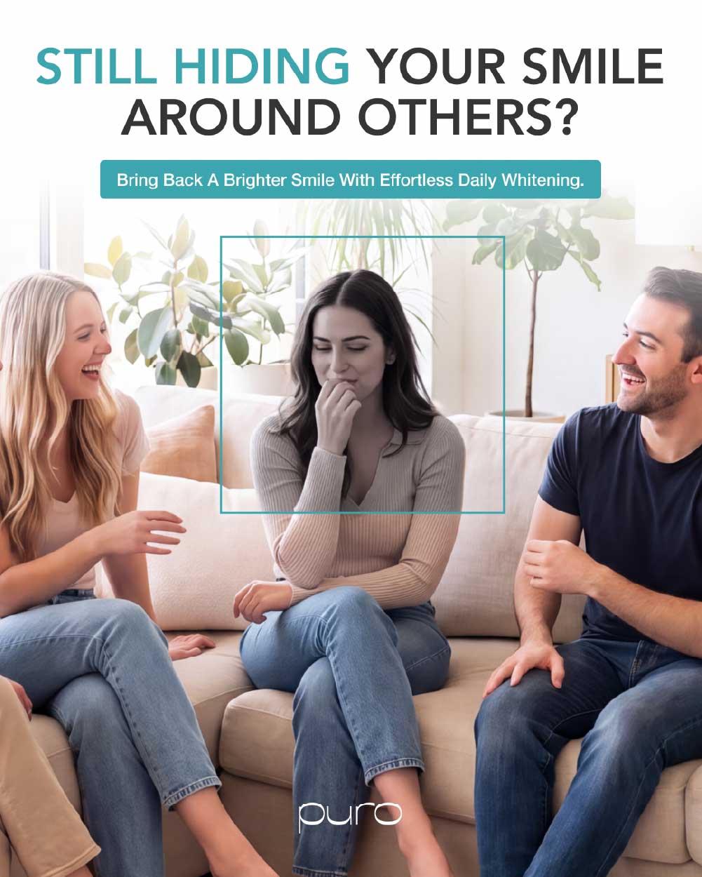
The ad opens with the emotionally relatable question, “Still hiding your smile around others?” The visual shows a group of friends together, with the central focus on one friend who is noticeably trying to hide her smile, immediately communicating the emotional problem. The message then shifts toward the solution with “Bring Back the Brighter Smile with Effortless Daily Whitening,” positioning Puro as an easy routine that can help her feel more confident. The contrast between hiding her smile and the promise of a brighter-looking smile creates a strong emotional narrative.

Why this works

  • Starts with a deeply relatable emotional pain point rather than a product feature.
  • The central character's body language makes the problem visually understandable without much copy.
  • The group-of-friends setting makes the situation feel real and socially relevant.
  • Connects teeth whitening with a bigger emotional benefit: confidence and freedom to smile.
  • “Effortless Daily Whitening” reduces the perceived effort required to address the problem.
  • Creates an emotional journey from self-consciousness to confidence, giving the product a meaningful role beyond simply whitening teeth.

Design 06

Whitening Strips - design 6

Angle of Communication

Social Proof / Customer Validation. The creative uses real customer feedback to build trust and reduce hesitation, showing potential buyers that other customers have already purchased and experienced the product.

Desire / Avatar

Avatar: Men and women who are interested in teeth whitening but want proof and reassurance before purchasing. They are influenced by customer experiences, ratings, and authentic testimonials when deciding whether a product is worth trying.
Core Desire: Feel confident that they are choosing a trusted whitening product that other customers are satisfied with.

Description

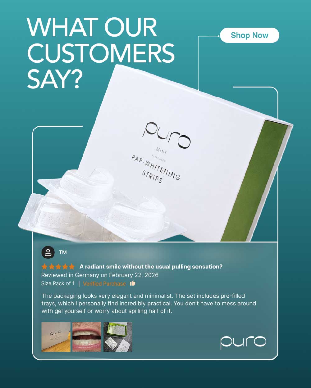
The ad opens with “What Our Customers Say?” and places a genuine customer testimonial from Amazon at the center of the creative. Reference images help reinforce the authenticity of the review, while the Puro logo strengthens brand recognition. A clear “Shop Now” CTA is included to turn the trust created by the testimonial into an immediate purchase action.

Why this works

  • Uses customer validation instead of relying only on brand claims.
  • Amazon testimonial provides a familiar source of third-party social proof.
  • Real customer feedback helps reduce purchase hesitation and uncertainty.
  • The reference imagery makes the testimonial feel more authentic and tangible.
  • Builds trust while keeping the product and brand visible.
  • The “Shop Now” CTA converts the credibility established by the review into a clear next step.

Design 07

Whitening Strips - design 7

Angle of Communication

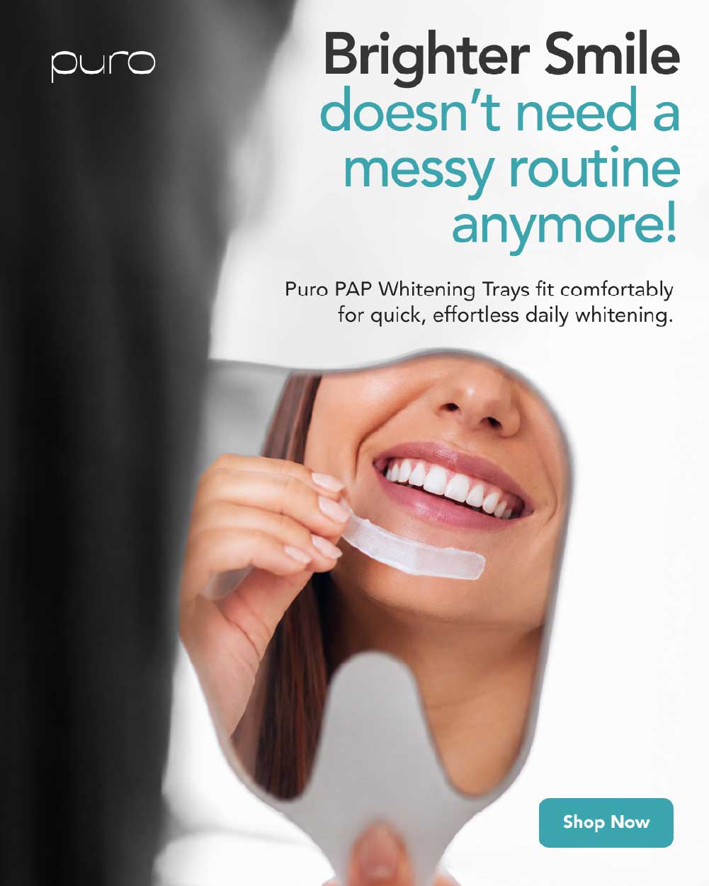
Convenience / Effortless Whitening. The creative positions Puro as a cleaner, simpler alternative to messy or complicated teeth-whitening routines.

Desire / Avatar

Avatar: Beauty-conscious men and women who want a brighter-looking smile but dislike messy, time-consuming, or inconvenient whitening methods. They value solutions that fit easily into their everyday routine.
Core Desire: Get a brighter-looking smile without dealing with a messy whitening routine.

Description

The ad opens with the bold message “Brighter Smile Doesn't Need a Messy Routine Anymore,” immediately addressing the frustration associated with inconvenient whitening methods. The visual features a beautiful woman smiling at herself in a mirror, creating a natural connection between whitening, beauty, self-confidence, and everyday life. The clean lifestyle visual keeps the focus on the desired outcome, while the “Shop Now” CTA encourages immediate action.

Why this works

  • Addresses a clear pain point: messy whitening routines.
  • Positions Puro as a simple and convenient alternative.
  • The mirror visual creates an aspirational connection with self-confidence and appearance.
  • Shows the desired outcome through a realistic lifestyle moment, rather than just displaying the product.
  • The message is easy to understand quickly while scrolling.
  • Combines convenience + beauty + emotional appeal, making the product feel like an effortless part of a daily routine.

Design 08

Whitening Strips - design 8

Angle of Communication

Frustration → Better Results. The creative highlights the frustration of using too many whitening products without seeing satisfying results, then contrasts that experience with the confidence of achieving a brighter-looking smile with Puro.

Desire / Avatar

Avatar: Men and women who have tried multiple teeth-whitening products but feel disappointed by the results. They want a simpler solution that feels more worthwhile and helps them feel confident about their smile.
Core Desire: Stop wasting time and money on multiple products and finally move toward a brighter-looking, more confident smile.

Description

The creative is split into two contrasting visuals. One side shows a greyed-out, stressed woman surrounded by multiple whitening products, representing frustration, product overload, and disappointing results. The other side shows a happy woman with a bright, confident-looking smile, representing the desired outcome. The headline “Too Many Products. Too Little Results.” immediately establishes the problem, while the “Shop Now” CTA positions Puro as the next step toward a simpler whitening experience.

Why this works

  • The headline immediately communicates a common frustration among people who have tried multiple products.
  • The two-sided visual contrast makes the problem and desired outcome instantly understandable.
  • The stressed woman creates an emotional representation of product fatigue and disappointment.
  • The happy, brighter-smile visual gives viewers a clear aspirational end state.
  • Creates a strong before-to-after emotional journey without relying solely on product features.
  • Speaks directly to shoppers who are already problem-aware and actively looking for another solution.
  • The “Shop Now” CTA turns that frustration into a clear action.

Design 09

Whitening Strips - design 9

Angle of Communication

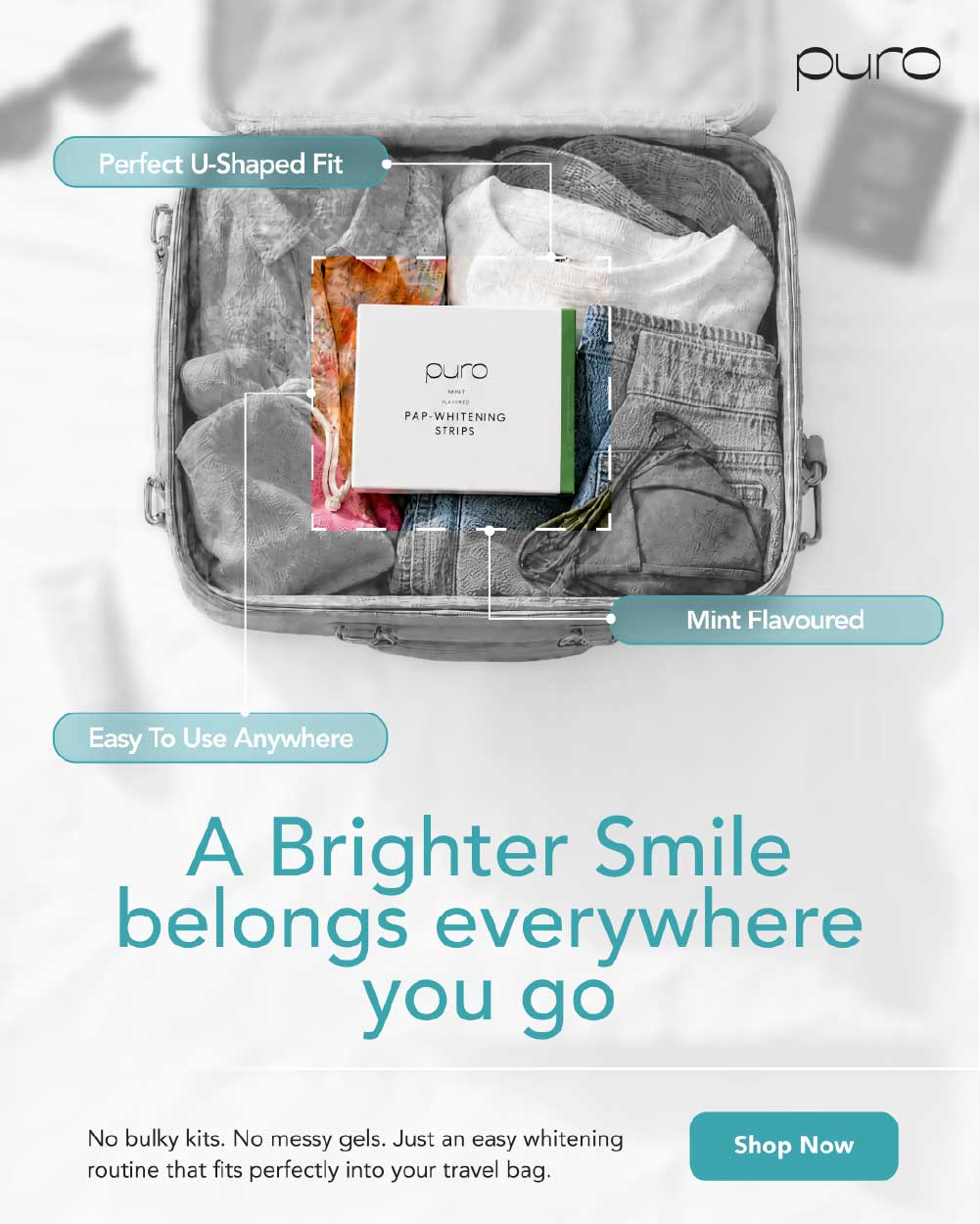
Portability & On-the-Go Whitening. The creative positions Puro as a convenient whitening solution that can easily travel with you, making it possible to maintain your whitening routine wherever you go.

Desire / Avatar

Avatar: Beauty-conscious men and women with busy, mobile lifestyles who travel, work, socialize, or spend time away from home and want a convenient whitening solution that doesn't require them to change their routine.
Core Desire: Keep up with their whitening routine anytime, anywhere while enjoying a simple and convenient experience.

Description

The creative opens with “A Brighter Smile Belongs Everywhere You Go,” connecting a brighter-looking smile with an active, on-the-go lifestyle. The Puro whitening strips are shown inside a bag, visually communicating their compact and portable nature. Key product benefits are highlighted, including Easy to Use, Mint Flavored, and Perfect U-Shaped Fit, while the “Shop Now” CTA encourages purchase.

Why this works

  • Connects whitening with a mobile, everyday lifestyle rather than limiting it to the bathroom or home.
  • The bag visual instantly communicates portability and convenience.
  • “Easy to Use” reduces the perceived effort of maintaining the routine.
  • Mint flavor adds an appealing sensory benefit to the product experience.
  • U-shaped fit gives shoppers a tangible product feature that reinforces usability.
  • The headline creates an emotional connection between a brighter-looking smile and confidence wherever you go.
  • Combines lifestyle appeal + practical benefits + portability, making the product feel easy to incorporate into daily life.

Design 10

Whitening Strips - design 10

Angle of Communication

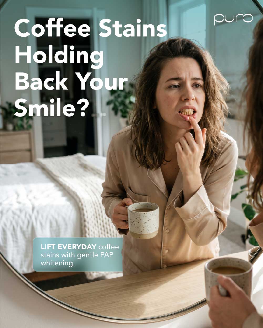
Everyday Stains → Smile Confidence. The creative focuses on coffee stains as a familiar everyday cause of a less-bright-looking smile, connecting the problem to the desire for a more confident smile.

Desire / Avatar

Avatar: Coffee drinkers and beauty-conscious men and women who notice their teeth looking less bright due to daily coffee habits and want an easy way to maintain a cleaner, brighter-looking smile.
Core Desire: Feel confident showing their smile without letting everyday coffee stains hold them back.

Description

The ad opens with the relatable question “Coffee Stains Holding Back Your Smile?” A woman is shown checking her teeth, creating a natural moment of self-awareness and visually communicating concern about the appearance of her smile. The creative connects an everyday habit with the emotional impact it can have on confidence, while the “Lift Everyday” CTA encourages viewers to take action toward a brighter-looking smile.

Why this works

  • Uses a specific everyday problem rather than a generic whitening message.
  • Coffee stains are highly relatable to regular coffee drinkers.
  • The woman checking her teeth creates an immediate self-recognition moment.
  • Connects the functional problem of stains with the emotional desire for smile confidence.
  • The visual feels natural and lifestyle-focused rather than overly promotional.
  • The “Lift Everyday” CTA reinforces the idea of making smile care part of an everyday routine.